


We spoke to concept artist and illustrator Kellan Jett, one of the minds behind indie story-em-up Where The Water Tastes Like Wine, about the game’s aesthetic, his OST vinyl sleeve, and tips for aspiring artists.
By Thomas Quillfeldt
When talent meets determination and passion in the same vessel, you get someone capable of making their mark on a game — or any collaborative creative endeavour. Concept artist and illustrator Kellan Jett is evidently such a character: someone with the grit to always be honing their craft; and the vision to be able to help establish a distinctive look for a project.

For three years of development Jett was effectively art director for the roaming storytelling game Where The Water Tastes Like Wine, contributing numerous beautiful illustrations and helping lead creator Johnnemann Nordhagen and other contributing artists hone the dirty Americana aesthetic. Where The Water... sees players travelling across the USA, picking up tales from eerie, supernatural strangers, and passing them on like currency.
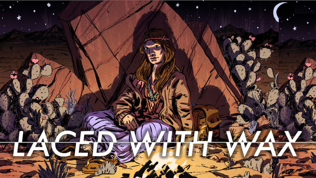
Jett also designed the vinyl sleeve for composer Ryan Ike’s eclectic soundtrack, available at Lacedrecords.com:

The art of America
Despite identifying as a “city person” rather than a country wanderer, one could argue that Kellan Jett was the perfect person to help craft a game about travelling the length and breadth of America. He grew up in Dallas, Texas; studied in Providence, Rhode Island; spent a lot of time with family in Wisconsin; and has currently settled in San Francisco, California.
Almost inevitably, Jett was drawn to art from a young age. After training as a medical illustrator, his mother became a fine artist; and, as far back as he can remember, Kellan always drew. “There was never a period of my life where it wasn’t the thing I was going to do. It wasn’t pre-ordained, but there was no point at which I felt like I made the choice to become an illustrator — I was constantly making that choice.”

Plein air (i.e. outdoor) gouache (i.e. watercolour) paintings by Kellan Jett; (left) Providence, Rhode Island; (right) San Francisco, California.
Steering away from AAA
“Later, I got serious about creating concept art for video games, as it was the convergence of two things that I loved.” He started to veer away from the idea of being a concept artist at a big company working on AAA games, right around the time the ‘Golden Age’ of indie games kicked off around 2008.
“The different aesthetics that interested me were better represented in the space that became ‘indie games’. AAA games in 2008 seemed to be just dudes with guns, grey corridors, Gears of War, Call of Duty, etc. I liked playing those games, but I had no interest in those art styles.”
Alongside indie games, Jett has done a variety of work for companies like Oculus and Cards Against Humanity.

Kellan Jett's Heaven and Hell campaign illustration for Cards Against Humanity.
When the painter met the creator
In mid-2014, having received a business card at LA games festival IndieCade, Johnnemann Nordhagen contacted Jett about working on a new project, receiving a straightforward “sure” in reply. Jett admits: “I was incredibly green, which I realised to some extent at the time, but not really. We figured things out together, which was difficult, but Johnnemann’s a great person to have gone through that tricky learning process with.”
At the start of Where The Water Tastes Like Wine’s development, Nordhagen had some basic sketches of what he envisaged. “They were tone pieces for what sorts of Americana mythology would be in the game; for instance, a skeleton walking by a river wearing a top hot. Some of it was a bit too ‘Grateful Dead’ for me, and the top hat had to go... but it was an important part of the process.”
One touchpoint was early to mid-20th Century fruit crate labels: “That kind of old graphic design with painted illustrations on them. That was starting point, and then we simplified it.”

Mid-20th Century fruit crate labels.

The main menu from Where The Water Tastes Like Wine.
Other artistic influences for the team included comic book artist Mike Mignola (Hellboy); for realism and Americana, the work of Noel Sickles; mid-20th Century illustrator Robert Fawcett; and contemporary illustrator Patrick Leger. Jett says: “I looked at Leger’s stuff a bunch not because I wanted something like his clean advertising style — we wanted the game to be dirty — but his looser ink stuff is incredible, and a perfect starting point for the non-fantastical things in the game, farmers, etc.”

Illustrations by (top left) Noel Sickles; (top right) Patrick Leger; (bottom) Mike Mignola.

Illustration by Robert Fawcett.
The game’s eventual overall art style is a result of Jett’s and Nordhagen’s contrasting — but not necessarily contradicting — visions. Jett adds: “I was a bit wary of it being too psychedelic, or tie-dye. And whilst Johnnemann wanted it to evoke the 1930s, he’s also a big Dead-head [Grateful Dead fan] and wanted it to be psychedelic, ‘60s-style. There’s also some ‘50s beat poetry in the tone of the writing.
“As far as a visual aesthetic goes, we had to encompass all of that in a way that was efficient and straightforward. We had to be more stark — a few colours, with mostly black and white on top.”

One of Jett’s early concept illustrations.
The supernatural tone runs throughout, but at one point in development there was a thought that the game would start out relatively realistic, before gradually becoming more mystical and macabre.

Final art relating to the character of Rose.
Representing a whole nation
In our Laced With Wax interview with Ryan Ike (“Where the Water Tastes Like Wine composer on soundtracking all the USA”), we sympathised that his brief — to compose music that represents a huge, diverse country — must have been an intimidating one.
Because of Jett’s involvement early in during the game’s gestation, he didn’t think of his task in quite the same way: “Where The Water... contains the mythology of America, but it’s only a slice of it.” He points out that the game is somewhat of an “abstract, big, weird ghost story”, rather than a specific, realistic period piece. The things that happen in the story occur vaguely between the Dust Bowl of the 1930s and the end of the 1960s.

Jett’s daytime and nighttime concept illustrations for the overworld map of Where The Water Tastes Like Wine — we’ve overlaid the nighttime version onto the daytime version to show the contrast.
Jett therefore didn’t feel the pressure of the geographical ambitions of the game — for him, what pressure there was came from their attempts to reflect the diversity of human experience during the time period. “Johnnemann and I talked a lot about representation, making sure that the suffering of marginalised people was made clear and was a subject that we tackled.”

Final artwork for the character Althea.
Whilst developing the game from 2014 to 2017, the pair were also part of an indie game community that was being rocked by the convulsions of a wider culture war being fought online. But, by the time Where The Water... launched in early 2018, the atmosphere had changed somewhat. Painfully, slowly, the conversation around diversity in games has changed, says Jett. “That’s because the people have changed. It’s a young industry. In games media, people don’t stay around for longer than 10 years, and when they do, they fall into a job that’s higher up and not in front of a camera or behind a podcast microphone.”
Indeed, some notable writers that had been calling for more diversity in video games were hired to write for Where The Water..., including Leigh Alexander, Austin Walker, and Cara Ellison.

Kellan Jett’s ink illustration of the genderqueer character Quinn from Where The Water Tastes Like Wine.
Making games is hard
The team faced all the usual challenges that small game development teams face (including tight resources and team members having to wear multiple hats) as outlined by Nordhagen in his refreshingly transparent postmortem of the game.
Various artists came and went on the project. An essential contributor was 3D artist Lauren Cason, who Jett worked with in order to consolidate the look of the game across 2D and 3D elements.

A screenshot from the overworld map of Where The Water Tastes Like Wine.
Despite having played such a central role, Jett left the project in early 2017, in part for financial reasons. Nevertheless, he and Nordhagen stayed friends and continued to share an office space, literally working “back-to-back”.
For Jett, this gave rise to bittersweet feelings about seeing the game finally ship in early 2018. On the one hand (and with the benefit of hindsight) “there was a bunch of stuff I wish I could have been around to put into the game. But then I thought ‘holy fuck, he actually did it! It’s totally great that the game is out!’ I loved working on it, and I’m incredibly proud of all that we put into it.”
Vinyl destination
A wonderful way for Jett to rejoin the project closer to launch was the opportunity to design the soundtrack vinyl sleeve and logotype. Returning to the visual world of Where The Water... after missing the final stages of development made him reflect on the original work: “I remembered ‘oh, right, I like doing this — I enjoy this aesthetic.’ I came up with new ideas, little visual things for the vinyl that could have been great in the game. The art style is slightly more ‘graphic’. It was a bittersweet feeling, but mostly sweet.
The process of designing the vinyl started with some rough sketches, which he then photographed and coloured loosely in Photoshop:

“It had to be relatively simple, and the look had to reflect the game. The colour palette came really easily to me. Mostly I was just worried about where I was going to put the text, because I don’t do a lot of illustration that has text overlaid on top of it. I was doing the logotype myself, so I wanted to make it easy — which is why I leaned towards having a dark to light gradient where possible.”

The final image that encompasses the back cover (left) and front cover (right) of the vinyl package.

The logotype for both the vinyl and the game.

The inside gatefold of the vinyl.
Jett says: “I’d love to do more vinyl. I like working on something physical that’s going to be printed. Working in games is awesome, and there’s a lot of fun to be had, but it’s a lot of moving parts. It’s a different, more demanding framework than working on a static vinyl cover, which is a focused illustration — the parameters don’t change the way a game does all the time. The process was so much less stressful.
“My favourite parts of the vinyl to work on were the disc labels because I got to play around with more graphics.”

Immediately prior to the Where The Water... OST vinyl, Jett completed his first ever album cover project:

Tips for budding artists and illustrators
Jett is full of great advice for artists, and especially artists looking to break into video games. First thing’s first: “You have to be drawing all the time. Most people that go to art school and are trying to be ‘artists’ think that they’re going to make it... and they don’t because they just aren’t spending the time doing it.
“I feel this way about myself sometimes: ‘Man I didn’t get enough work in this week.’ This is especially the case with illustration, where you have to produce on demand, and hone your vision. It takes a huge amount of practise.
“On top of that, [the whole process of improving] just takes time. You have to work on your craft at all times, but not stress excessively about it — that pressure to improve too quickly can lead to paralysis where you’re convinced that ‘none of this is good enough’.
“Also, rip off artists that are better than you! If you’re young, you should be doing that regularly — just not too blatantly!”

A piece of Jett’s concept art for in-development title Miegakure.
“As far as tools, creating digital concept art means learning Photoshop, that’s really important. But traditional techniques — pencil, pens, paints, and paper — are incredibly important because there are rules there — rules of physics, the chemistry of paint. They restrict you in a way that allows you to focus because you’re fighting against the medium a bit.
“Some people can find it annoying, but I think it’s really helpful because the only thing scarier than a blank page is a blank computer screen. There’s just nothing tangible [with digital art], so even when you put down one stroke, it doesn’t feel like you’ve even done that; whereas in traditional media, you put down a stroke and it’s permanent, it’s there. There’s no undo button — you have spend physical energy to erase something.
“This is the case even if you want to be a graphic designer. In a lot of art schools, graphic design students start doing exercises with gouache [watercolour paints] and cut paper; and flat colour, screen printing, etc.”

A piece of Kellan Jett’s concept art for in-development title Overpass.
Jett realised the value of face-to-face networking early on — something that helped him score the Where The Water... gig. “Going to a place — San Francisco, Los Angeles, Seattle, etc. — is important, even if it’s just for conferences. Because there’s too much shit online. There are too many people.
“Meeting people is important, combined with being a naïve, curious person [i.e. not a know-it-all] and asking people about things.” He recommends going to shows like PAX, approaching video game artists whose work you admire, sharing your portfolio, and offering simple, authentic compliments: “Just say: ‘I like your art’. If you can do that as a naïve young person, people are going to give you the benefit of the doubt — as long as you’re not weird or a creep.” This final point is especially important: “Young people, especially young nerds — among whom I count myself — get very excited. You need to know, or learn, that when there’s somebody you want to talk to, you shouldn’t go and hover next to them whilst they’re talking to someone else.”
For Jett, those keys to success have seen him establish himself in a crowded market: constant practise tempered by patience with one’s own speed of development; practising with both digital and traditional art tools; and face-to-face networking.
Kellan Jett is a San Francisco-based concept artist and illustrator – www.kellanjett.com | jettpack.tumblr.com | Twitter.com/kjettpack | Instagram.com/kellan_jett
Where The Water Tastes Like Wine is available on Steam, itch.io, and GOG.
The Where The Water Tastes Like Wine double LP vinyl is available from www.lacedrecords.com.
